View All
UI/UX
Product Design
2024
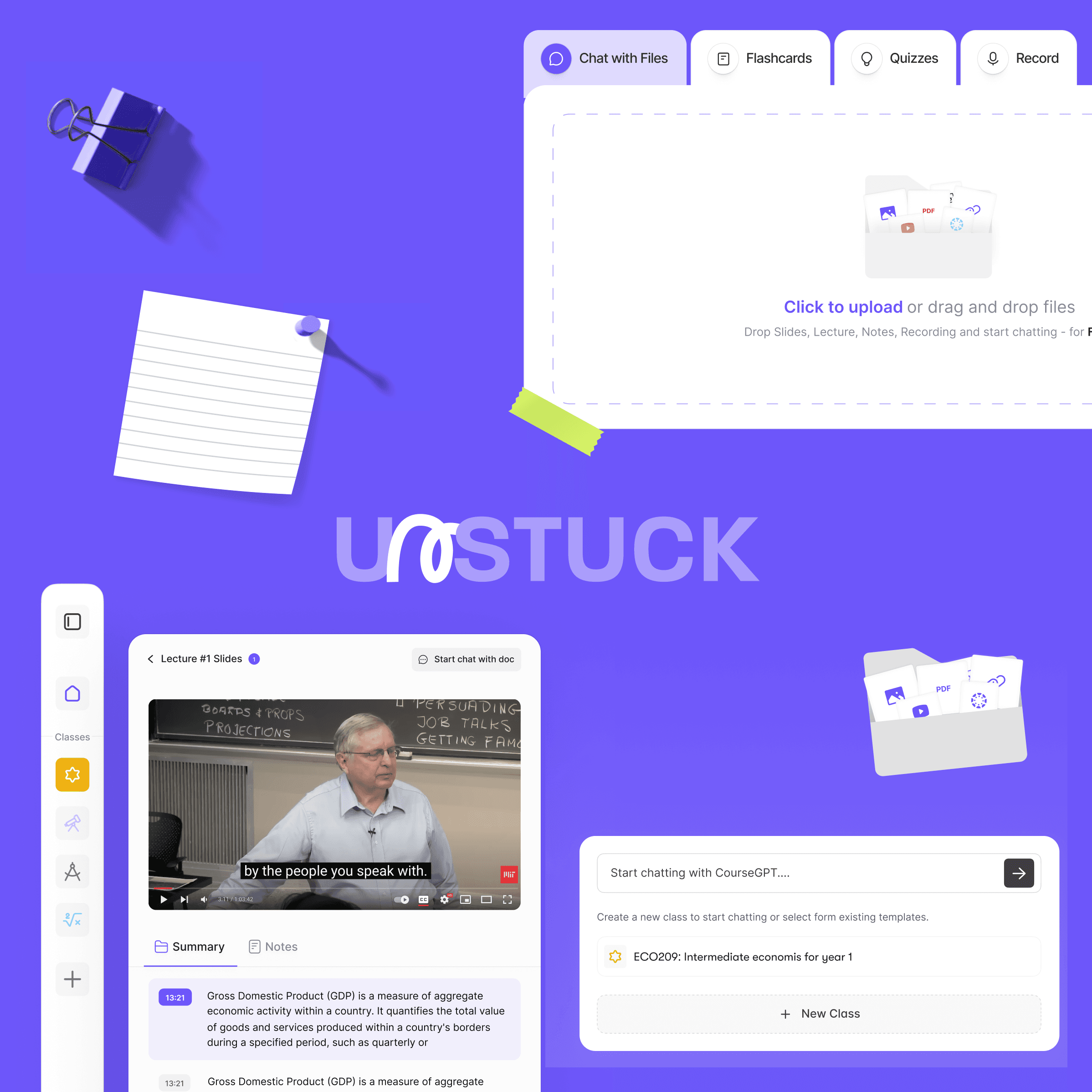
Unstuck is a platform that lets students upload their class notes, PDFs, and recordings, then chat directly with their files to understand and study faster. The idea was strong. The tech worked. But the experience? Not so much.
When I joined the team, the product felt like a mix of quick fixes and patchwork UI. Useful features like flashcards, quizzes, and class spaces were non existent. The layout was inconsistent, the flows weren’t intuitive, and users didn’t know what the platform was really capable of.
What Wasn’t Working
Inconsistent UI and scattered design patterns
Old UI design style, and confusing UX
No clear path for first-time users to get value fast

The Changes Introduced
We didn’t just touch up the visuals we tore things down and rebuilt from the core up:
Reworked the main flows so anyone could upload, ask questions, and create quizzes in minutes
Created a new design language that felt clean, smart, and built for students
Defined a full system that worked across web, tablet, and mobile
Made space for growth, so new features could be added without cluttering the experience

Extending the Experience: Mobile
Once the web experience felt solid, we moved to mobile. Not to replace the platform, but to support it wherever users are.
Students study on the go. They review notes on the bus, flip through flashcards between classes, or snap photos of notes after lectures. The mobile layer needed to be fast, simple, and fully in sync with the web.
So we designed lightweight, focused mobile tools that:
Let students record their Lectures
Create flashcards and quizzes on the go
Jump back into active classes without friction
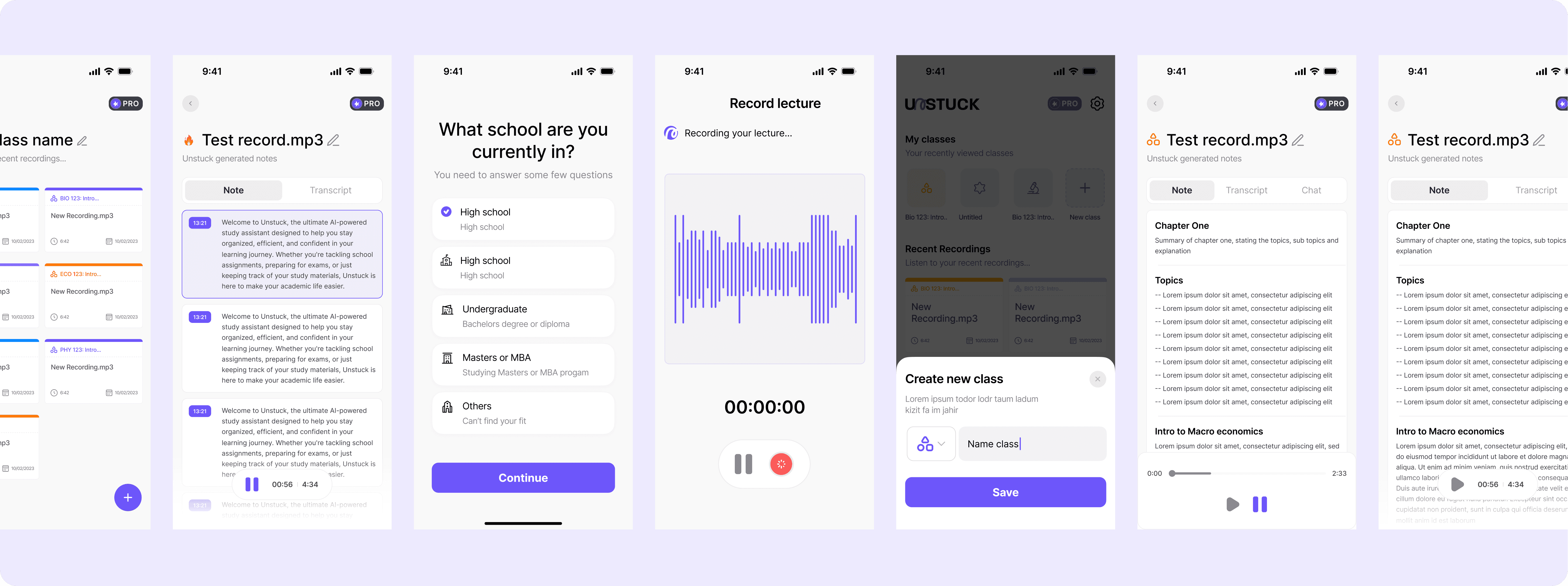
Key Components Created
Clean dashboard to organize files and classes
Chat-based interface to ask questions and get instant answers
Simple quiz builder that pulls directly from study material
Smart flashcards with spaced repetition
Responsive layouts across desktop, tablet, and mobile

Final Thoughts
Unstuck always had the vision. What it needed was focus—and a product experience that felt as smart as the idea behind it. We helped the team turn a scattered MVP into a thoughtful, usable platform that works everywhere students study.
Design isn’t about making things pretty. It’s about making things make sense. That’s exactly what we did here.
Explore More

LET'S CHAT